Wayfinding around complex buildings and spaces is a difficult task. The main tactic is usually static signage. However this has problems in the volume of information that can be presented and more importantly absorbed and understood by the user. To deal with this we are seeing more interesting ways to convey wayfinding information - here are some examples that we've come across recently
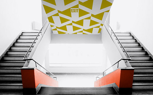
Firstly, is Wayfinder Wallpaper created by Mike&Maaike for rollout. An essentially decorative finish that attempts to embed wayfinding information in the visual.
The second example is the design for the Eureka Tower Car Park in Melbourne by Axel Peemoeller. This uses distorted lettering on the walls which when viewed from the right angle give a strong message.
Finally, a signage and wayfinding approach from Ralston & Bau for the Storehagen Atrim in Norway. This borrows heavily from railway/metro maps and signage to provide wayfinding in an office building. This provides a common visual linkage throughout the building.
So there many other visual ways in which users can be helped to navigate spaces and these can integrate well into the interior design. We can't be sure how well any of these examples or other similar designs work but we found them thought-provoking in at least thinking of other ways to help people make sense of a space.Labels: wayfinding